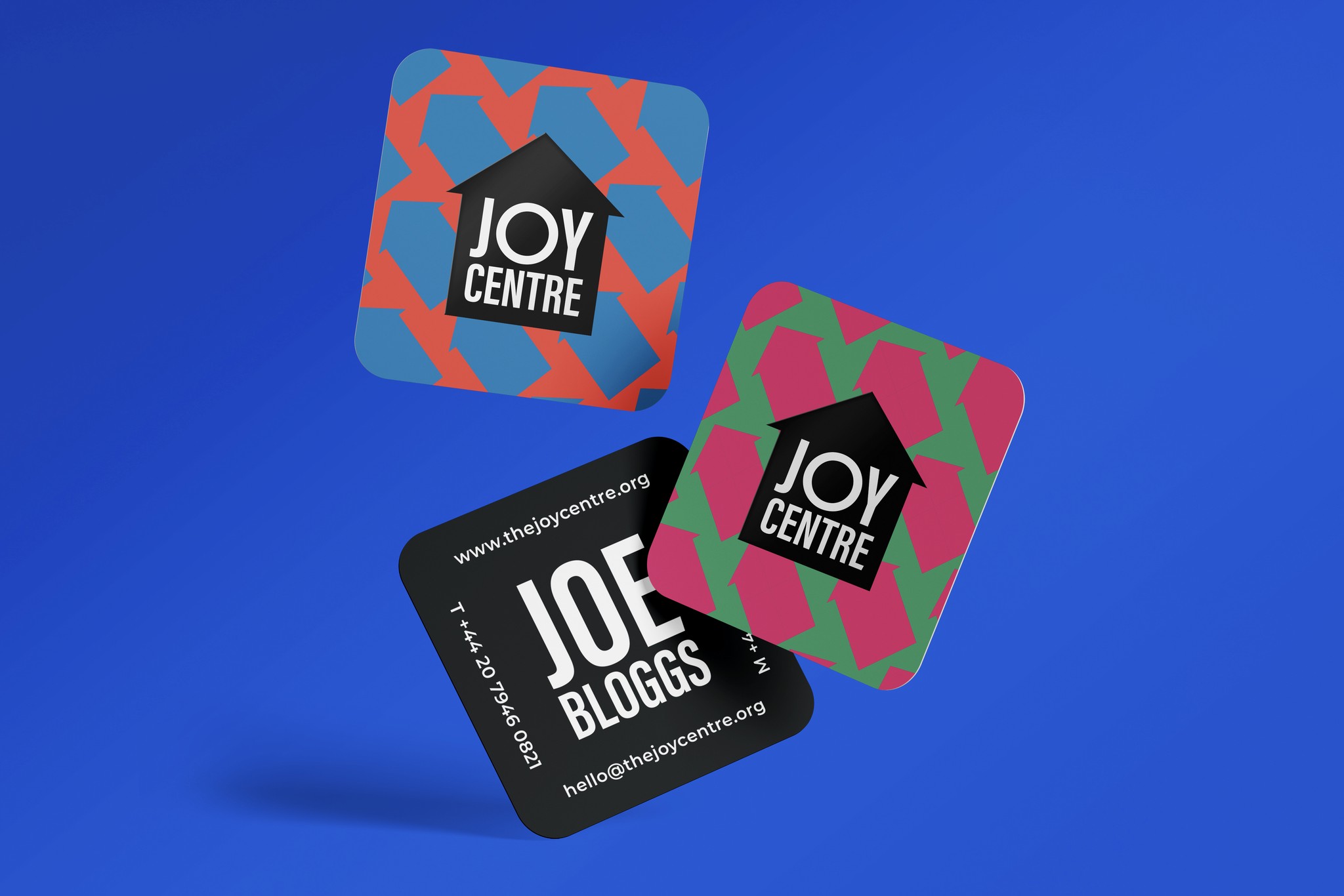


Joy Centre
Joy Centre
Brand Identity
I was honoured to be commissioned to help form and develop the brand identity of the Joy Centre as part of its development towards NGO status. Joy Centre works with children who are abandoned, homeless, from low-income families or who have experienced trauma and aims to give them a sense of belonging so they can thrive.
The final logo design incorporates a simple house icon, which also resembles an upward-facing arrow. This symbolises the nurturing and uplifting roles that the Joy Centre plays in young people's lives. Alongside the logo, the 'O' in the wordmark is round, bold, and symmetrical, contrasting with the rest of the condensed letters. This contrast signifies a transition from repression to joy, from being closed off to opening up. The logo and typography are complemented by a bold and playful colour palette that completes the identity.
Services
Logo Design, Brand Identity, Strategy, Product
Brief
The Joy Centre required a brand identity that reflects its mission to provide a safe, loving, and nurturing environment for children from marginalised backgrounds. The branding needed to convey a sense of hope, healing, and opportunity, mirroring the organisation's dedication to transforming the lives of the children they serve. The design had to be warm, welcoming, and uplifting, resonating with the values of love, acceptance, and belonging at the heart of the Joy Centre's work.


